Render Objects in Flutter
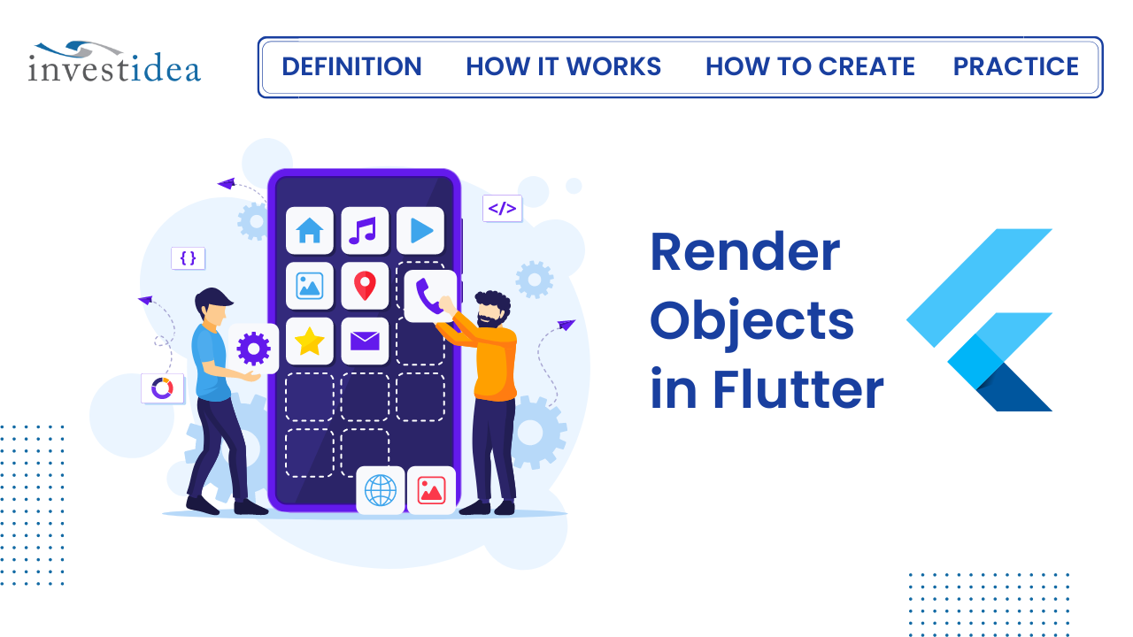
Flutter's captivating world extends beyond the widgets you see on the surface. Behind the scenes, a powerful layer called render objects orchestrates the magic of layout, painting, and visual representation. This blog delves into the core concepts of render objects and empowers you to understand how they bring your Flutter apps to life.
How does rendering work in Flutter?
Before we launch into the RenderObjects and their uses, power, and importance, let’s take a quick look at how rendering occurs in Flutter.
Flutter uses widgets that hold configuration information in the fields or parameters passed to the widget. The widget here serves as a “container” of sorts: it holds these configuration parameters but doesn’t use them. The widget instantiates and becomes inflated into an element.
This element is inserted into the element tree and represents the widget, and each element in the element tree has a RenderObject attached to it. These RenderObjects are responsible for controlling configuration parameters like sizes, layouts, and painting of the widgets to the screen, forming the UI we see.
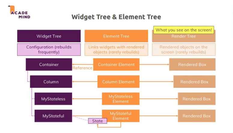
Looking at this flow from widgets to elements to RenderObjects, you might notice that the main work happens in the RenderObjects — things like adjusting the sizes, painting the widgets to the screens, and manipulating various parameters all occur inside the RenderObjects.
Understanding RenderObjects definitely would aid you in building quality mobile applications. So what exactly are these RenderObjects?
What are Render Objects?
While widgets define the UI structure and functionality, render objects handle the nitty-gritty details of how those widgets are displayed on the screen. They are the workhorses responsible for:
- Sizing: Determining the size and position of each element within your layout.
- Layout: Arranging elements in a specific order and hierarchy.
- Painting: Taking care of the visual aspects, like drawing text, shapes, and images.
- Semantics: Providing accessibility information for assistive technologies.
Think of widgets as the blueprints for your UI, and render objects as the builders who take those blueprints and translate them into a tangible visual experience.
How to create your own RenderObject
Before creating the widget, have a look at a skeletal outline of its contents:
class _GradientColoredSliderRenderObjectWidget extends LeafRenderObjectWidget {
  @override
  GradientColoredSliderRender createRenderObject(...) {}
  @override
  void updateRenderObject(...) {}
  @override
  void debugFillProperties(...) {}
}
- Your widget will extend
LeafRenderObjectWidgetbecause it won’t have any children. If you were making a render object with one child you would useSingleChildRenderObjectWidgetand for multiple children, you’d useMultiChildRenderObjectWidget. - The Flutter framework (that is, the element) will call
createRenderObjectwhen it wants to create the render object associated with this widget. - Widgets are inexpensive to create, but it would be expensive to recreate render objects every time there was an update. So when a widget property changes, the system will call
updateRenderObject, where you will simply update the public properties of your render object without recreating the whole object. - The
debugFillPropertiesmethod provides information about the class properties during debugging, but it’s not very interesting for the purposes of this article.
Render object
In this section, you’ll create the render object class and add the properties you need.
Creating the class
Create a new class named _GradientColoredSliderRender as shown below
class _GradientColoredSliderRender extends RenderBox {}
RenderBox is a subclass of RenderObject and has a two-dimensional coordinate system. That is, it has a width and a height.
Adding the constructor
Add the following constructor to _GradientColoredSliderRender:
  _GradientColoredSliderRender({
    required double value,
    required List<Color> gradientColors,
    required _GradientColoredSliderState state,
    double? desiredBarWidth,
    double? desiredBarSpace,
    ValueChanged<double>? onChangeStart,
    ValueChanged<double>? onChangeEnd,
    ValueChanged<double>? onChanged,
  })
      : _state = state,
        onChangeStart = onChangeStart,
        onChangeEnd = onChangeEnd,
        _value = value,
        _onChanged = onChanged,
        _gradientColors = gradientColors,
        _gradientStops = List.generate(gradientColors.length, (index) => index / gradientColors.length),
        _desiredBarWidth = desiredBarWidth ?? _defaultBarWidth,
        _desiredBarSpace = desiredBarSpace ?? _defaultBarSpace,
        _lineEdgeRadius = (desiredBarWidth ?? _defaultBarWidth) / 2
This defines the public properties that you want, but you’ll see some errors since you haven’t created the private fields for them yet. You’ll do that next.
Adding the properties
Add the code for barWidth:
  set barWidth(double value) {
    assert(value >= 0.0);
    if (_desiredBarWidth == value) return;
    _desiredBarWidth = value;
    _computeBarSize(size);
    markNeedsPaint();
  }
Since the setter is updating the color, you’ll need to repaint the bar with a new barWidth. Calling markNeedsPaint at the end of the method tells the framework to call the paint method at some point in the near future. Since painting can be potentially expensive, you should only call markNeedsPaint when necessary. That’s the reason for the early return at the beginning of the setter.
Layout and size
If you tried to use your widget now like this:
         Container(
                margin: EdgeInsets.symmetric(horizontal: 16),
                height: 50,
                child: GradientColoredSlider(
                  value: _topSliderValue,
                  barWidth: 8,
                  barSpace: 4,
                  onChanged: (double value) {
                    setState(() {
                      _topSliderValue = value;
                    });
                  },
                ),
              ),
The IDE wouldn’t complain to you (until you try to run the app). Even if you did run the app, though, there would be nothing to see. One reason is that your widget doesn’t have any intrinsic size, and the other reason is that you haven’t painted any content. First, let’s handle the size issue.
On a typical screen, you’d probably want the width to expand to whatever the parent width is. But for the height, you’d want it to hug the height of the handle.
Given that information, you can set the size.
Setting the desired size
The computeDryLayout method is where you should calculate how big your widget will be based on the given constraints. In the past, this was done performLayout but now you can put the logic in the compute dry layout and just reference it from performLayout. See more information here.
Add the following code to _GradientColoredSliderRender:
  @override
  Size computeDryLayout(BoxConstraints constraints) {
    return Size(constraints.hasBoundedWidth ? constraints.maxWidth : _minPreferredTrackWidth,
        constraints.hasBoundedHeight ? constraints.maxHeight : _minPreferredTrackHeight);
  }
- If you need the sizes of any children you can get them by calling the child’s
getDryLayoutmethod and passing in some min and max size constraints. (The old way was to calllayouton each of them from insideperformLayout.) This gives you (that is, the parent render object) the information you need to place the children and determine your own size. (Remember the quote, “Constraints go down. Sizes go up. Parent sets position.”) SinceRenderProgressBardoesn’t have any children, though, (you made aLeafRenderObjectWidgetif you recall), all you need to do here is calculate your own size. - The
constraintsvariable is of typeBoxContraintsand is a property ofRenderBox. TheseBoxContraintsare passed in from the parent and tell you the max and min width and length that you’re allowed to be. You can choose any size for yourself within those bounds. By choosingmaxWidthyou’re saying that you want to expand to be as big as the parent allows. For the desired height you’re hugging your content by using thethumbSizeproperty. - Passing your desired size in
constraints.constrainmakes sure that you are still within the allowed constraints. For example, ifthumbSizewere large, it could exceed theconstraints.maxHeightfrom the parent, which isn’t allowed. - The
sizevariable is also a property ofRenderBox. You should only set it from within theperformLayoutmethod. Everywhere else you should callmarkNeedsLayout. Also, thecomputeDryLayoutmethod should not change any state. - If you’re simply expanding to fill the parent or wrapping a single child, then you don’t need to override
performLayout. See the documentation for more on this.
Now you’ve officially set the size of your render object, and the parent render object will also have that information.
Setting the intrinsic size
Given only a height constraint, how wide would your widget naturally want to be? Or given only a width constraint, how tall would your widget naturally want to be? That’s what intrinsic size is all about.
Add the following four methods to _GradientColoredSliderRender:
@override
  double computeMinIntrinsicWidth(double height) =>
      _minPreferredTrackWidth + _thumbShape
          .getPreferredSize(isInteractive)
          .width;

  @override
  double computeMaxIntrinsicWidth(double height) =>
      _minPreferredTrackWidth + _thumbShape
          .getPreferredSize(isInteractive)
          .width;

  @override
  double computeMinIntrinsicHeight(double width) =>
      math.max(_minPreferredTrackHeight, _thumbShape
          .getPreferredSize(isInteractive)
          .height);

  @override
  double computeMaxIntrinsicHeight(double width) =>
      math.max(_minPreferredTrackHeight, _thumbShape
          .getPreferredSize(isInteractive)
          .height);
Painting
All the drawing action of a rendered object happens in the paint method.
Add the following code to the _GradientColoredSliderRender class:
 @override
  void paint(PaintingContext context, Offset offset) {
    final canvas = context.canvas;
    final left = offset.dx;
    final right = size.width + left;
    final top = size.height / 2 - size.height / 2;
    final bottom = top + size.height;

    final Rect drawRect = Rect.fromLTRB(left, top, right, bottom);
    final Rect trackRect = Rect.fromLTRB(
        drawRect.left + _thumbShape.enabledThumbRadius,
        drawRect.top + RoundThumbShape.marginRingWidth,
        drawRect.right - _thumbShape.enabledThumbRadius,
        drawRect.bottom - RoundThumbShape.marginRingWidth);

    _drawLines(canvas, trackRect);

    final Offset thumbCenter = Offset(
        drawRect.left + _thumbShape.enabledThumbRadius + _value * (drawRect.width - 2 * _thumbShape.enabledThumbRadius),
        drawRect.center.dy);

    _thumbShape.paint(context, thumbCenter,
        activationAnimation: _thumbAnimation,
        enableAnimation: _enableAnimation,
        size: size,
        value: _value,
        thumbCenter: thumbCenter);
  }
_drawLines method is called to iterate through the calculated number of bars (_adjustedBarCount) that make up the slider track.For each bar:
- The getCurrentColor function is used to retrieve the appropriate gradient color based on the bar's position within the track. This involves calculating the corresponding stop on the gradient based on the bar's relative location.
- A Paint object is created and configured with the retrieved gradient color. Paint objects encapsulate various attributes like color, stroke width, style (fill or stroke), and blending mode.
- The drawLine method of the canvas is called to draw a line segment representing a single bar within the track. The line's starting and ending points are calculated based on the bar's position, _desiredBarWidth, and _desiredBarSpace properties.
The _thumbShape.paint(canvas) method is called to render the slider thumb.
- The
_thumbShapeobject, typically aRoundThumbShapeinstance, encapsulates the logic for drawing and positioning the thumb. - Its
paintmethod likely utilizes the canvas to draw a circular shape using thedrawCirclemethod. It configures the paint object with the appropriate gradient color (potentially determined by the user's interaction or enabled state) and applies shadow effects using canvas methods likedrawShadow.
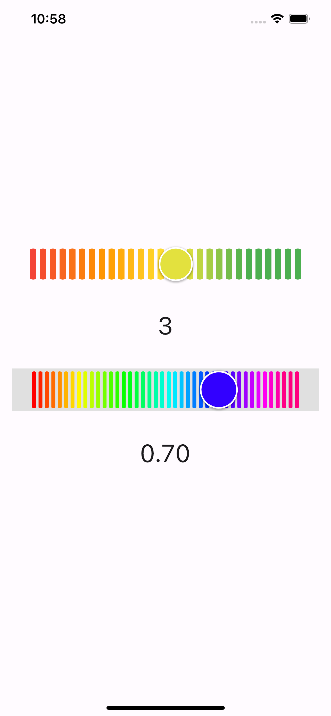
Using our Render Object in practice
class HomePage extends StatefulWidget {
  @override
  _HomePageState createState() => _HomePageState();
}

class _HomePageState extends State<HomePage> {
  static const _TOP_SLIDER_MAX_STEP = 5;

  double _topSliderValue = 0.3;
  double _bottomSliderValue = 0.7;

  @override
  Widget build(BuildContext context) {
    return SafeArea(
      child: Scaffold(
        body: Center(
          child: Column(
            mainAxisAlignment: MainAxisAlignment.center,
            children: [
              Container(
                margin: EdgeInsets.symmetric(horizontal: 16),
                height: 50,
                child: GradientColoredSlider(
                  value: _topSliderValue,
                  barWidth: 8,
                  barSpace: 4,
                  onChanged: (double value) {
                    setState(() {
                      _topSliderValue = value;
                    });
                  },
                ),
              ),
              const SizedBox(height: 32),
              Text('${_rangedSelectedValue(_TOP_SLIDER_MAX_STEP, _topSliderValue)}', style: TextStyle(fontSize: 32)),
              const SizedBox(height: 32),
              Container(
                margin: EdgeInsets.symmetric(horizontal: 16),
                height: 55,
                color: Colors.grey[300],
                child: GradientColoredSlider(
                  value: _bottomSliderValue,
                  barWidth: 5,
                  barSpace: 3,
                  gradientColors: _colors,
                  onChanged: (double value) {
                    setState(() {
                      _bottomSliderValue = value;
                    });
                  },
                ),
              ),
              const SizedBox(height: 32),
              Text(_bottomSliderValue.toStringAsFixed(2), style: TextStyle(fontSize: 32)),
            ],
          ),
        ),
      ),
    );
  }
Save and run your application. You should see the custom render object we just create and the impact it has on the layout of the app.
Full Source Code:
import 'package:flutter/material.dart';
import 'package:render_object/grandient_color.dart';

void main() {
  runApp(const MyApp());
}

class MyApp extends StatelessWidget {
  const MyApp({super.key});
  @override
  Widget build(BuildContext context) {
    return MaterialApp(
      title: 'Flutter Demo',
      theme: ThemeData(
        colorScheme: ColorScheme.fromSeed(seedColor: Colors.deepPurple),
        useMaterial3: true,
      ),
      home:  HomePage(),
    );
  }
}

class HomePage extends StatefulWidget {
  @override
  _HomePageState createState() => _HomePageState();
}

class _HomePageState extends State<HomePage> {
  static const _TOP_SLIDER_MAX_STEP = 5;

  double _topSliderValue = 0.3;
  double _bottomSliderValue = 0.7;

  @override
  Widget build(BuildContext context) {
    return SafeArea(
      child: Scaffold(
        body: Center(
          child: Column(
            mainAxisAlignment: MainAxisAlignment.center,
            children: [
              Container(
                margin: EdgeInsets.symmetric(horizontal: 16),
                height: 50,
                child: GradientColoredSlider(
                  value: _topSliderValue,
                  barWidth: 8,
                  barSpace: 4,
                  onChanged: (double value) {
                    setState(() {
                      _topSliderValue = value;
                    });
                  },
                ),
              ),
              const SizedBox(height: 32),
              Text('${_rangedSelectedValue(_TOP_SLIDER_MAX_STEP, _topSliderValue)}', style: TextStyle(fontSize: 32)),
              const SizedBox(height: 32),
              Container(
                margin: EdgeInsets.symmetric(horizontal: 16),
                height: 55,
                color: Colors.grey[300],
                child: GradientColoredSlider(
                  value: _bottomSliderValue,
                  barWidth: 5,
                  barSpace: 3,
                  gradientColors: _colors,
                  onChanged: (double value) {
                    setState(() {
                      _bottomSliderValue = value;
                    });
                  },
                ),
              ),
              const SizedBox(height: 32),
              Text(_bottomSliderValue.toStringAsFixed(2), style: TextStyle(fontSize: 32)),
            ],
          ),
        ),
      ),
    );
  }

  final List<Color> _colors = [
    Color.fromARGB(255, 255, 0, 0),
    Color.fromARGB(255, 255, 128, 0),
    Color.fromARGB(255, 255, 255, 0),
    Color.fromARGB(255, 128, 255, 0),
    Color.fromARGB(255, 0, 255, 0),
    Color.fromARGB(255, 0, 255, 128),
    Color.fromARGB(255, 0, 255, 255),
    Color.fromARGB(255, 0, 128, 255),
    Color.fromARGB(255, 0, 0, 255),
    Color.fromARGB(255, 127, 0, 255),
    Color.fromARGB(255, 255, 0, 255),
    Color.fromARGB(255, 255, 0, 127),
  ];
}

int _rangedSelectedValue(int maxSteps, double value) {
  double stepRange = 1.0 / maxSteps;
  return (value / stepRange + 1).clamp(1, maxSteps).toInt();
}
library gradient_colored_slider;

import 'package:flutter/foundation.dart';
import 'package:flutter/gestures.dart';
import 'package:flutter/material.dart';
import 'package:flutter/rendering.dart';
import 'package:flutter/widgets.dart';
import 'dart:math' as math;

/// A GradientColoredSlider slider.
///
/// Used to select from a range of values.
///
/// {@tool dartpad --template=stateful_widget_scaffold}
///
/// ![GradientColoredSlider]
/// (https://user-images.githubusercontent.com/88337052/132976448-2ea07ef7-1cb6-4024-9fa0-e7507b1d0a16.png)
///
/// The GradientColoredSlider value is part of the Stateful widget subclass to change the value
/// setState was called.
///
/// ```dart
/// double _currentSliderValue = 0.5;
///
/// @override
/// Widget build(BuildContext context) {
///   return GradientColoredSlider(
///     value: _currentSliderValue,
///     onChanged: (double value) {
///       setState(() {
///         _currentSliderValue = value;
///       });
///     },
///   );
/// }
/// ```
/// {@end-tool}
///
/// The terms for the parts of a slider are:
///
///  * The "thumb", which is a shape that slides horizontally when the user
///    drags it.
///  * The "track", which is the gradient line that the slider thumb slides along.
///
/// The slider will be disabled if [onChanged] is null.
///
/// The slider widget itself does not maintain any state. Instead, when the state
/// of the slider changes, the widget calls the [onChanged] callback. Most
/// widgets that use a slider will listen for the [onChanged] callback and
/// rebuild the slider with a new [value] to update the visual appearance of the
/// slider. To know when the value starts to change, or when it is done
/// changing, set the optional callbacks [onChangeStart] and/or [onChangeEnd].
///
/// By default, a slider will be as wide as possible, centered vertically. When
/// given unbounded constraints, it will attempt to make the track 144 pixels
/// wide ([_GradientColoredSliderRender._minPreferredTrackWidth] with half of
/// thumb [RoundThumbShape.enabledThumbRadius] margins on each side)
/// and will shrink-wrap vertically.
///
/// To determine how slider track should be displayed  you can override
/// [gradientColors], [barWidth] and [barSpace] properties.
///
class GradientColoredSlider extends StatefulWidget {
  /// Creates a GradientColoredSlider.
  ///
  /// The slider itself does not maintain any state. Instead, when the state of
  /// the slider changes, the widget calls the [onChanged] callback. Most
  /// widgets that use a slider will listen for the [onChanged] callback and
  /// rebuild the slider with a new [value] to update the visual appearance of
  /// the slider.
  ///
  /// * [value] determines currently selected value for this slider.
  /// * [onChanged] is called while the user is selecting a new value for the
  ///   slider.
  /// * [onChangeStart] is called when the user starts to select a new value for
  ///   the slider.
  /// * [onChangeEnd] is called when the user is done selecting a new value for
  ///   the slider.
  ///
  /// You can override slider track gradient colors with the [gradientColors] property,
  /// as well as tracks [barWidth] and [barSpace] properties.

  const GradientColoredSlider({required this.value,
    required this.onChanged,
    this.onChangeStart,
    this.onChangeEnd,
    this.barWidth = _defaultBarWidth,
    this.barSpace = _defaultBarSpace,
    this.gradientColors = _defaultGradientColors,
    Key? key})
      : super(key: key);

  /// The currently selected value for this slider.
  ///
  /// The slider thumb is drawn at a position that corresponds to this value.
  final double value;

  /// Called during a drag when the user is selecting a new value for the slider
  /// by dragging.
  ///
  /// The slider passes the new value to the callback but does not actually
  /// change state until the parent widget rebuilds the slider with the new
  /// value.
  ///
  /// If null, the slider will be displayed as disabled.
  ///
  /// The callback provided to onChanged should update the state of the parent
  /// [StatefulWidget] using the [State.setState] method, so that the parent
  /// gets rebuilt; for example:
  ///
  /// {@tool snippet}
  ///
  /// ```dart
  /// GradientColoredSlider(
  ///   value: _sliderValue.toDouble(),
  ///   onChanged: (double newValue) {
  ///     setState(() {
  ///       _sliderValue = newValue.round();
  ///     });
  ///   },
  /// )
  /// ```
  /// {@end-tool}
  ///
  /// See also:
  ///
  ///  * [onChangeStart] for a callback that is called when the user starts
  ///    changing the value.
  ///  * [onChangeEnd] for a callback that is called when the user stops
  ///    changing the value.
  final ValueChanged<double>? onChanged;

  /// Called when the user starts selecting a new value for the slider.
  ///
  /// This callback shouldn't be used to update the slider [value] (use
  /// [onChanged] for that), but rather to be notified when the user has started
  /// selecting a new value by starting a drag or with a tap.
  ///
  /// The value passed will be the last [value] that the slider had before the
  /// change began.
  ///
  /// {@tool snippet}
  ///
  /// ```dart
  /// GradientColoredSlider(
  ///   value: _sliderValue.toDouble(),
  ///   onChanged: (double newValue) {
  ///     setState(() {
  ///       _sliderValue = newValue.round();
  ///     });
  ///   },
  ///   onChangeStart: (double startValue) {
  ///     print('Started change at $startValue');
  ///   },
  /// )
  /// ```
  /// {@end-tool}
  ///
  /// See also:
  ///
  ///  * [onChangeEnd] for a callback that is called when the value change is
  ///    complete.
  final ValueChanged<double>? onChangeStart;

  /// Called when the user is done selecting a new value for the slider.
  ///
  /// This callback shouldn't be used to update the slider [value] (use
  /// [onChanged] for that), but rather to know when the user has completed
  /// selecting a new [value] by ending a drag or a click.
  ///
  /// {@tool snippet}
  ///
  /// ```dart
  /// GradientColoredSlider(
  ///   value: _sliderValue.toDouble(),
  ///   onChanged: (double newValue) {
  ///     setState(() {
  ///       _sliderValue = newValue.round();
  ///     });
  ///   },
  ///   onChangeEnd: (double newValue) {
  ///     print('Ended change on $newValue');
  ///   },
  /// )
  /// ```
  /// {@end-tool}
  ///
  /// See also:
  ///
  ///  * [onChangeStart] for a callback that is called when a value change
  ///    begins.
  final ValueChanged<double>? onChangeEnd;

  /// Slider track's gradient colors, by default [_defaultGradientColors]
  final List<Color> gradientColors;

  /// Slider track's bar width, by default [_defaultBarWidth] = 4
  final double barWidth;

  /// Slider track's bar space, by default [_defaultBarSpace] = 2
  final double barSpace;

  @override
  _GradientColoredSliderState createState() => _GradientColoredSliderState();

  @override
  void debugFillProperties(DiagnosticPropertiesBuilder properties) {
    super.debugFillProperties(properties);
    properties.add(DoubleProperty('value', value));
    properties.add(ObjectFlagProperty<ValueChanged<double>>('onChanged', onChanged, ifNull: 'disabled'));
    properties.add(ObjectFlagProperty<ValueChanged<double>>.has('onChangeStart', onChangeStart));
    properties.add(ObjectFlagProperty<ValueChanged<double>>.has('onChangeEnd', onChangeEnd));
    properties.add(IterableProperty('gradientColors', gradientColors, defaultValue: _defaultGradientColors));
    properties.add(DoubleProperty('barWidth', barWidth, defaultValue: _defaultBarWidth));
    properties.add(DoubleProperty('barSpace', barSpace, defaultValue: _defaultBarSpace));
  }

  static const _defaultGradientColors = [Colors.red, Colors.orange, Colors.yellow, Colors.green];
  static const double _defaultBarWidth = 4;
  static const double _defaultBarSpace = 2;
}

class _GradientColoredSliderState extends State<GradientColoredSlider> with TickerProviderStateMixin {
  static const Duration enableAnimationDuration = Duration(milliseconds: 75);

  // Animation controller that is run when enabling/disabling the slider.
  late AnimationController enableController;

  // Animation controller that is run when thumb scales in response to user interaction.
  late AnimationController thumbController;

  // ValueNotifier that is updated when the slider is dragged.
  late ValueNotifier valueNotifier;

  @override
  void initState() {
    super.initState();
    thumbController = AnimationController(
      duration: enableAnimationDuration,
      vsync: this,
    );
    enableController = AnimationController(
      duration: enableAnimationDuration,
      vsync: this,
    );

    valueNotifier = ValueNotifier(widget.value);
    enableController.value = widget.onChanged != null ? 1.0 : 0.0;
  }

  @override
  void dispose() {
    thumbController.dispose();
    enableController.dispose();
    valueNotifier.dispose();
    super.dispose();
  }

  @override
  Widget build(BuildContext context) {
    return _GradientColoredSliderRenderObjectWidget(
      value: widget.value,
      barWidth: widget.barWidth,
      barSpace: widget.barSpace,
      gradientColors: widget.gradientColors,
      state: this,
      onChanged: widget.onChanged,
      onChangeStart: widget.onChangeStart,
      onChangeEnd: widget.onChangeEnd,
    );
  }
}

/// A RenderObjectWidget to leverage RenderBox API.
///
/// Since the slider doesn't have children - LeafRenderObjectWidget is used.
///
class _GradientColoredSliderRenderObjectWidget extends LeafRenderObjectWidget {
  final ValueChanged<double>? onChangeStart;
  final ValueChanged<double>? onChangeEnd;
  final ValueChanged<double>? onChanged;
  final double barWidth;
  final double barSpace;
  final double value;
  final _GradientColoredSliderState state;
  final List<Color> gradientColors;

  _GradientColoredSliderRenderObjectWidget({required this.value,
    required this.state,
    required this.barWidth,
    required this.barSpace,
    required this.gradientColors,
    this.onChanged,
    this.onChangeStart,
    this.onChangeEnd,
    Key? key})
      : super(key: key);

  @override
  _GradientColoredSliderRender createRenderObject(BuildContext context) {
    return _GradientColoredSliderRender(
        desiredBarWidth: barWidth,
        desiredBarSpace: barSpace,
        gradientColors: gradientColors,
        state: state,
        value: value,
        onChanged: onChanged,
        onChangeEnd: onChangeStart,
        onChangeStart: onChangeEnd);
  }

  @override
  void updateRenderObject(BuildContext context, _GradientColoredSliderRender renderObject) {
    renderObject
      ..onChanged = onChanged
      ..onChangeStart = onChangeStart
      ..onChangeEnd = onChangeEnd
      ..value = value
      ..barWidth = barWidth
      ..barSpace = barSpace;
  }
}

class _GradientColoredSliderRender extends RenderBox {
  static const double _minPreferredTrackWidth = 144.0;
  static const double _minPreferredTrackHeight = 36.0;

  static const _defaultBarWidth = 4.0;
  static const _defaultBarSpace = 2.0;

  late double _desiredBarWidth;
  late double _desiredBarSpace;
  late double _adjustedBarSpace;
  late double _adjustedBarCount;
  late double _lineEdgeRadius;

  late final List<Color> _gradientColors;
  late final List<double> _gradientStops;

  late final _GradientColoredSliderState _state;
  late HorizontalDragGestureRecognizer _drag;
  late TapGestureRecognizer _tap;
  late RoundThumbShape _thumbShape;
  late Animation<double> _enableAnimation;
  late Animation<double> _thumbAnimation;

  ValueChanged<double>? onChangeStart;
  ValueChanged<double>? onChangeEnd;

  double _currentDragValue = 0.0;

  _GradientColoredSliderRender({
    required double value,
    required List<Color> gradientColors,
    required _GradientColoredSliderState state,
    double? desiredBarWidth,
    double? desiredBarSpace,
    ValueChanged<double>? onChangeStart,
    ValueChanged<double>? onChangeEnd,
    ValueChanged<double>? onChanged,
  })
      : _state = state,
        onChangeStart = onChangeStart,
        onChangeEnd = onChangeEnd,
        _value = value,
        _onChanged = onChanged,
        _gradientColors = gradientColors,
        _gradientStops = List.generate(gradientColors.length, (index) => index / gradientColors.length),
        _desiredBarWidth = desiredBarWidth ?? _defaultBarWidth,
        _desiredBarSpace = desiredBarSpace ?? _defaultBarSpace,
        _lineEdgeRadius = (desiredBarWidth ?? _defaultBarWidth) / 2 {
    final GestureArenaTeam team = GestureArenaTeam();
    _drag = HorizontalDragGestureRecognizer()
      ..team = team
      ..onStart = _handleDragStart
      ..onUpdate = _handleDragUpdate
      ..onEnd = _handleDragEnd
      ..onCancel = _endInteraction;
    _tap = TapGestureRecognizer()
      ..team = team
      ..onTapDown = _handleTapDown
      ..onTapUp = _handleTapUp
      ..onTapCancel = _endInteraction;
    _enableAnimation = CurvedAnimation(
      parent: _state.enableController,
      curve: Curves.easeInOut,
    );
    _thumbAnimation = CurvedAnimation(
      parent: _state.thumbController,
      curve: Curves.fastOutSlowIn,
    );
  }

  @override
  void attach(PipelineOwner owner) {
    super.attach(owner);
    _enableAnimation.addListener(markNeedsPaint);
    _thumbAnimation.addListener(markNeedsPaint);
    _state.valueNotifier.addListener(markNeedsPaint);
  }

  @override
  void detach() {
    _enableAnimation.removeListener(markNeedsPaint);
    _thumbAnimation.removeListener(markNeedsPaint);
    _state.valueNotifier.removeListener(markNeedsPaint);
    super.detach();
  }

  void _handleTapUp(TapUpDetails details) {
    _endInteraction();
  }

  void _handleDragEnd(DragEndDetails details) {
    _endInteraction();
  }

  void _handleDragStart(DragStartDetails details) {
    _startInteraction(details.globalPosition);
  }

  void _endInteraction() {
    if (!_state.mounted) {
      return;
    }

    if (_state.mounted) {
      onChangeEnd?.call(_clamp(_currentDragValue));
      _currentDragValue = 0.0;
      _state.thumbController.reverse();
    }
  }

  void _handleDragUpdate(DragUpdateDetails details) {
    if (!_state.mounted || details.primaryDelta == null) {
      return;
    }

    final double valueDelta = details.primaryDelta! / _trackRect.width;
    _currentDragValue += valueDelta;

    onChanged?.call(_clamp(_currentDragValue));
  }

  bool get isInteractive => onChanged != null;

  ValueChanged<double>? get onChanged => _onChanged;

  ValueChanged<double>? _onChanged;

  set onChanged(ValueChanged<double>? value) {
    if (value == _onChanged) {
      return;
    }
    final bool wasInteractive = isInteractive;
    _onChanged = value;
    if (wasInteractive != isInteractive) {
      if (isInteractive) {
        _state.enableController.forward();
      } else {
        _state.enableController.reverse();
      }
      markNeedsPaint();
      markNeedsSemanticsUpdate();
    }
  }

  void _handleTapDown(TapDownDetails details) {
    _startInteraction(details.globalPosition);
  }

  double get value => _value;
  double _value;

  set value(double newValue) {
    assert(newValue >= 0.0 && newValue <= 1.0);
    final double convertedValue = newValue;
    if (convertedValue == _value) {
      return;
    }
    _value = convertedValue;
    _state.valueNotifier.value = convertedValue;

    markNeedsSemanticsUpdate();
  }

  void _startInteraction(Offset globalPosition) {
    if (isInteractive) {
      // We supply the *current* value as the start location, so that if we have
      // a tap, it consists of a call to onChangeStart with the previous value and
      // a call to onChangeEnd with the new value.

      onChangeStart?.call(_clamp(value));
      _currentDragValue = _getValueFromGlobalPosition(globalPosition);
      onChanged?.call(_clamp(_currentDragValue));
      _state.thumbController.forward();
    }
  }

  double _clamp(double v) {
    return v.clamp(0.0, 1.0);
  }

  // This rect is used in gesture calculations, where the gesture coordinates
  // are relative to the sliders origin. Therefore, the offset is passed as
  // (0,0).
  Rect get _trackRect =>
      Rect.fromPoints(Offset.zero, Offset(size.width - _thumbShape
          .getPreferredSize(isInteractive)
          .width, size.height));

  double _getValueFromGlobalPosition(Offset globalPosition) {
    final double visualPosition =
        (globalToLocal(globalPosition).dx - _trackRect.left - _thumbShape
            .getPreferredSize(isInteractive)
            .width / 2) /
            _trackRect.width;
    return visualPosition;
  }

  @override
  void handleEvent(PointerEvent event, BoxHitTestEntry entry) {
    assert(debugHandleEvent(event, entry));
    if (event is PointerDownEvent) {
      // We need to add the drag first so that it has priority.
      _drag.addPointer(event);
      _tap.addPointer(event);
    }
  }

  set barWidth(double value) {
    assert(value >= 0.0);
    if (_desiredBarWidth == value) return;
    _desiredBarWidth = value;
    _computeBarSize(size);
    markNeedsPaint();
  }

  set barSpace(double value) {
    assert(value >= 0.0);
    if (_desiredBarSpace == value) return;
    _desiredBarSpace = value;
    _computeBarSize(size);
    markNeedsPaint();
  }

  @override
  double computeMinIntrinsicWidth(double height) =>
      _minPreferredTrackWidth + _thumbShape
          .getPreferredSize(isInteractive)
          .width;

  @override
  double computeMaxIntrinsicWidth(double height) =>
      _minPreferredTrackWidth + _thumbShape
          .getPreferredSize(isInteractive)
          .width;

  @override
  double computeMinIntrinsicHeight(double width) =>
      math.max(_minPreferredTrackHeight, _thumbShape
          .getPreferredSize(isInteractive)
          .height);

  @override
  double computeMaxIntrinsicHeight(double width) =>
      math.max(_minPreferredTrackHeight, _thumbShape
          .getPreferredSize(isInteractive)
          .height);

  @override
  bool hitTestSelf(Offset position) => true;

  @override
  set size(Size value) {
    if (!hasSize || size != value) {
      _computeBarSize(value);
    }
    super.size = value;
  }

  _computeBarSize(Size value) {
    _thumbShape = RoundThumbShape(
        enabledThumbRadius: value.height / 2 - RoundThumbShape.marginRingWidth,
        disabledThumbRadius: value.height / 2 - RoundThumbShape.marginRingWidth,
        pressedElevation: 3,
        gradientColors: _gradientColors,
        gradientStops: _gradientStops);

    _adjustedBarCount =
        (value.width - _desiredBarSpace - 2 * _thumbShape.enabledThumbRadius) / (_desiredBarWidth + _desiredBarSpace);
    double totalLineWidth = _adjustedBarCount.toInt() * _desiredBarWidth;
    _adjustedBarSpace =
        (value.width - 2 * _thumbShape.enabledThumbRadius - totalLineWidth) / (_adjustedBarCount.toInt() - 1);
  }

  @override
  Size computeDryLayout(BoxConstraints constraints) {
    return Size(constraints.hasBoundedWidth ? constraints.maxWidth : _minPreferredTrackWidth,
        constraints.hasBoundedHeight ? constraints.maxHeight : _minPreferredTrackHeight);
  }

  @override
  bool get sizedByParent => true;

  @override
  bool get isRepaintBoundary => true;

  @override
  void paint(PaintingContext context, Offset offset) {
    final canvas = context.canvas;
    final left = offset.dx;
    final right = size.width + left;
    final top = size.height / 2 - size.height / 2;
    final bottom = top + size.height;

    final Rect drawRect = Rect.fromLTRB(left, top, right, bottom);
    final Rect trackRect = Rect.fromLTRB(
        drawRect.left + _thumbShape.enabledThumbRadius,
        drawRect.top + RoundThumbShape.marginRingWidth,
        drawRect.right - _thumbShape.enabledThumbRadius,
        drawRect.bottom - RoundThumbShape.marginRingWidth);

    _drawLines(canvas, trackRect);

    final Offset thumbCenter = Offset(
        drawRect.left + _thumbShape.enabledThumbRadius + _value * (drawRect.width - 2 * _thumbShape.enabledThumbRadius),
        drawRect.center.dy);

    _thumbShape.paint(context, thumbCenter,
        activationAnimation: _thumbAnimation,
        enableAnimation: _enableAnimation,
        size: size,
        value: _value,
        thumbCenter: thumbCenter);
  }

  _drawLines(Canvas canvas, Rect trackRect) {
    canvas.save();
    canvas.translate(trackRect.left, trackRect.top);
    for (int i = 0; i < _adjustedBarCount.toInt(); i++) {
      _drawLine(i, trackRect.height, canvas);
    }
    canvas.restore();
  }

  _drawLine(int lineNumber, double height, Canvas canvas) {
    Path path = Path();
    double beginX = (_adjustedBarSpace + _desiredBarWidth) * lineNumber;
    double endX = beginX + _desiredBarWidth;

    path.moveTo(beginX, _lineEdgeRadius);
    path.lineTo(beginX, height - _lineEdgeRadius);

    path.arcToPoint(Offset(endX, height - _lineEdgeRadius),
        radius: Radius.circular(_lineEdgeRadius * 2), clockwise: false);
    path.lineTo(endX, _lineEdgeRadius);
    path.arcToPoint(Offset(beginX, _lineEdgeRadius), radius: Radius.circular(_lineEdgeRadius * 2), clockwise: false);
    canvas.drawPath(
        path, Paint()
      ..color = _getCurrentColor(lineNumber / _adjustedBarCount, _gradientColors, _gradientStops));
  }
}

class RoundThumbShape {
  /// Create a slider thumb that draws a circle.
  const RoundThumbShape({
    required this.enabledThumbRadius,
    this.disabledThumbRadius,
    this.elevation = 1.0,
    this.pressedElevation = 6.0,
    required this.gradientColors,
    required this.gradientStops,
  });

  static const marginRingWidth = 2.0;

  final List<Color> gradientColors;
  final List<double> gradientStops;

  /// The preferred radius of the round thumb shape when the slider is enabled.
  final double enabledThumbRadius;

  /// The preferred radius of the round thumb shape when the slider is disabled.
  final double? disabledThumbRadius;

  double get _disabledThumbRadius => disabledThumbRadius ?? enabledThumbRadius;

  /// The resting elevation adds shadow to the unpressed thumb.
  ///
  /// The default is 1.
  final double elevation;

  /// The pressed elevation adds shadow to the pressed thumb.
  ///
  /// The default is 6.
  final double pressedElevation;

  Size getPreferredSize(bool isEnabled) {
    return Size.fromRadius(isEnabled == true ? enabledThumbRadius : _disabledThumbRadius);
  }

  void paint(PaintingContext context,
      Offset center, {
        required Animation<double> activationAnimation,
        required Animation<double> enableAnimation,
        required double value,
        required Size size,
        required Offset thumbCenter,
      }) {
    final Canvas canvas = context.canvas;

    final height = size.height;
    final enabledThumbRadius = height / 2 - RoundThumbShape.marginRingWidth;
    final disabledThumbRadius = height / 2 - RoundThumbShape.marginRingWidth;
    final Tween<double> radiusTween = Tween<double>(
      begin: disabledThumbRadius,
      end: enabledThumbRadius,
    );

    Color thumbColor = _getCurrentColor(value, gradientColors, gradientStops);

    final ColorTween thumbColorTween = ColorTween(
      begin: Color.alphaBlend(thumbColor.withOpacity(0.5), Colors.black87),
      end: thumbColor,
    );
    final ColorTween shadowColorTween = ColorTween(
      begin: Colors.transparent,
      end: Colors.black,
    );

    final Color color = thumbColorTween.evaluate(enableAnimation)!;
    final Color shadowColor = shadowColorTween.evaluate(enableAnimation)!;
    final double radius = radiusTween.evaluate(enableAnimation);

    final Tween<double> elevationTween = Tween<double>(
      begin: elevation,
      end: pressedElevation,
    );

    final double evaluatedElevation = elevationTween.evaluate(activationAnimation);
    final Path path = Path()
      ..addArc(Rect.fromCenter(center: center, width: 2 * radius, height: 2 * radius), 0, math.pi * 2);
    canvas.drawShadow(path, shadowColor, evaluatedElevation, true);

    canvas.drawCircle(
      center,
      (radius - marginRingWidth * (1 - activationAnimation.value)),
      Paint()
        ..color = Colors.white
        ..style = PaintingStyle.stroke
        ..isAntiAlias = true
        ..strokeWidth = marginRingWidth,
    );

    canvas.drawCircle(center, radius + evaluatedElevation - 2 * marginRingWidth, Paint()
      ..color = color);
  }
}

Color _getCurrentColor(double t, List<Color> gradientColors, List<double> gradientStops) {
  if (t <= gradientStops.first) return gradientColors.first;
  if (t >= gradientStops.last) return gradientColors.last;
  final int index = gradientStops.lastIndexWhere((double s) => s <= t);
  return Color.lerp(gradientColors[index], gradientColors[index + 1],
      (t - gradientStops[index]) / (gradientStops[index + 1] - gradientStops[index]))!;
}
Conclusion
Render objects are the unsung heroes of Flutter development. By understanding their role and capabilities, you can construct visually compelling and performant user interfaces that elevate your Flutter applications. So, the next time you build a Flutter UI, remember the power of rendering objects working behind the scenes to bring your designs to life!
Further study
- RenderBox documentation (must read)
- A definitive guide to RenderObjects in Flutter (video)
- Drawing Every Line Pixel-perfectly with Custom Render Objects — Pure #FlutterClock face
- A deep dive into Flutter’s accessibility widgets
- Read the Flutter source code for any widget that is similar to what you want to make.


Comments ()